It is no secret that we are big fans of Lars Boogaard, editor visualisations at the NOS. We spoke with him about the function and hierarchical place of data visualisation in the newsroom.
Tell me, what exactly do you do at NOS?
‘I am not some kind of hardcore data journalist who is trying to find windows for stories the entire day. I make visualisations that accompany the stories my colleagues write. This means I do a lot of different things. At the moment we are creating a story about windmills, then, the question where the windmills stand rises quickly. This results in me searching for data which I visualise thereafter. At the moment, my function name is Editor online visualisations. I actually combine different disciplines and expertises: thinking in visual possibilities and having an eye for journalistic stories and newsworthiness.’How do you work together?
‘Preferably the editors involve me as soon as possible. When they are still in the research process, I can guide them in the right direction. Editors are inclined to either expose the bigger picture or zoom in on exceptions. While a visualisation actually enables them to share the complete information.’Is it hard to convince colleagues about the added value of data visualisation?
‘I want to infect other people in the editorial office with the datavirus by showing them what LocalFocus makes possible and that there is no magic needed. It doesn’t have to be that complex. I want others to get familiar with data.”What is the vision of colleague-editors on data visualisation?
‘We do a lot of research at NOS. For example, we spread questionnaires or we ask municipalities some questions. We always want to provide the clearest view of any situation. The research is done anyway, with or without my visualisations. Visualisations enable the reader to choose their own story. With this attribute, we reach more people. And because visualisations give a complete overview of the research, the work of my colleagues is fully showcased.’What is your vision on data journalism in comparison to ‘normal’ journalism?
‘I actually think data journalism is not very different from any other form of journalism. In both cases you try to find the right information, gather this and create a story. As a data journalist you do keep in mind that there has to be a visualisation in the end. Just like it is with text, you choose a form and you look at the data from that point of view.’
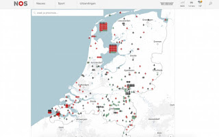
Sometimes you put things on the map we did not even think of ourselves. Like this map with missing war planes from World War II. How did you get this idea?
Sometimes you put things on the map we did not even think of ourselves. Like this map with missing war planes from World War II. How did you get this idea?
‘A colleague was working on this story about missing airplanes from World War II. There are multiple investigations that went into this topic and there already was some valuable information available. When my colleague wanted to put it on a map, he asked me for my help. Visualising this data would help us reach many more people. We immediately got the idea to put planes on the map, because this data was not visualised before. There is a reason for that, because how do you put something that is missing on a map? I solved this problem by giving all missing planes their own coordinate, allowing me to put the planes in clusters on the map. This made it clear that the planes are missing in that specific area and not at that specific location.’
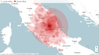
And how did you create the map of the earthquake in Italy?
‘I used Keyhole Markup Language for this. That is a specific code with enables you to add shapes to a map. I got the data from the seismology institute in the United States. They calculate earthquakes and visualise them in Google Earth. I used their data to put the earthquake in Italy on the map. We tried to be as specific as possible, because there are many Dutch tourists in Italy.
Have you ever encountered restrictions when putting data on a map?
‘Yes, but only occasionally. When you work with data, you will always more and better. You start with data on municipality level, but then you want more. Neighbourhoods, streets, nothing is in-depth enough. Then the system sometimes blocks because we are asking too much. That makes sense as well, when you work with data on this specific level, you can also program a map yourself.’


